In June, I published an article titled “What is The ‘Average Investor Allocation to Equities’ Telling Us?” What follows is a quarterly update to that piece.
In the article, I reference my favorite chart, the “Average Investor Allocation to Equities”. Since June, the “Average Investor Allocation to Equities” has increased in value, thus suggesting that the projected 10-year forward annualized price return for the S&P 500 has decreased modestly. The data for the chart comes from the Federal Reserve Bank of St. Louis and is updated quarterly.
I’ll start with the chart and then get into the analysis.
Author Created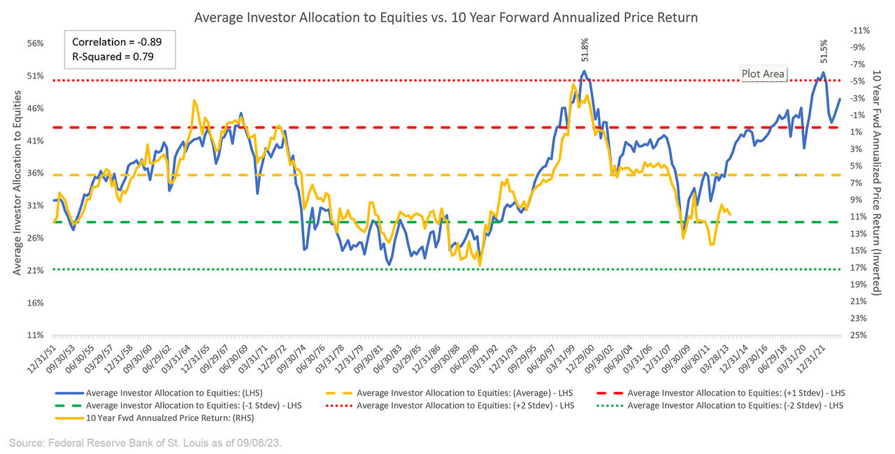
I find it is usually helpful to start with a definition and I’ll use the one I have provided in the past:
“The blue line in the chart shows the “Average Investor Allocation to Equities”. As the name would imply, this line shows how much (i.e., what percentage) of the average investor’s portfolio is allocated to equities at any given time as opposed to other asset classes (i.e., fixed income, commodities, cash, etc.) This line maps to the left-hand scale of the chart.
The yellow line in the chart shows the “10-Year Forward Annualized Price Return” of the S&P 500 Index. This is telling us what the 10-year forward return was for the S&P 500 Index from the corresponding point on the blue line. This line maps to the right-hand scale of the chart and the values have been inverted to better show the relationship between the two metrics.”
Next, we want to understand how to interpret this chart:
“Very simply, the higher the blue line (i.e., the “Average Investor Allocation to Equities”), the lower the subsequent 10-year return for the S&P 500 Index and vice versa.
Given the tightness of fit for these two lines (note the correlation figure in the top left-hand corner of the chart), I have created a model to project forward returns for the S&P 500 Index (see chart below).”
The current “Average Investor Allocation to Equities” figure is 47.40% as of June 30, 2023 (our most recent update). This corresponds to a projected annualized return of -0.73% over the next 10 years for the S&P 500 Index.
Author Created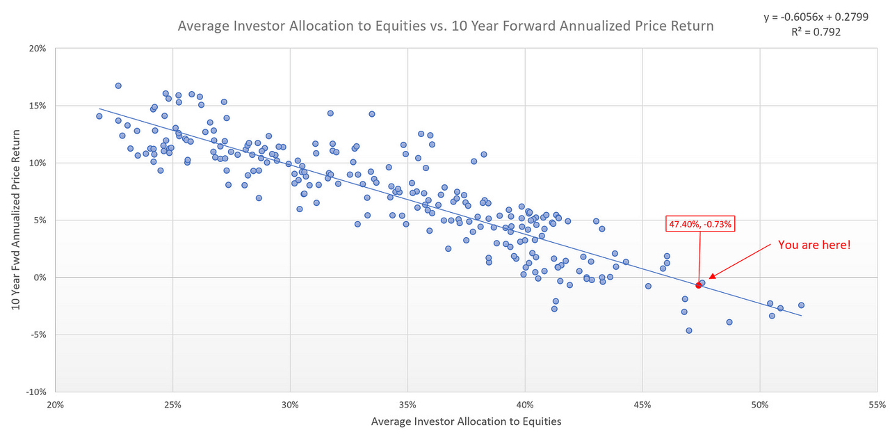
It is important to remind readers that this does not mean that we should expect a return of approximately -0.73% every year for the next 10 years. Instead, what it means is that over the next decade, we will likely see a market that has very dramatic sell-offs followed by very dramatic rallies which will net out to effectively a return of -0.73% over the next 10 years.
Taking it a step further
The following chart is the same chart as the first one above but I’ve broken it down into three different segments. The first two segments represent a full cycle (i.e., trough-peak-trough) for the Average Investor’s Allocation to Equities. The third segment is the current cycle which has yet to complete.
Author Created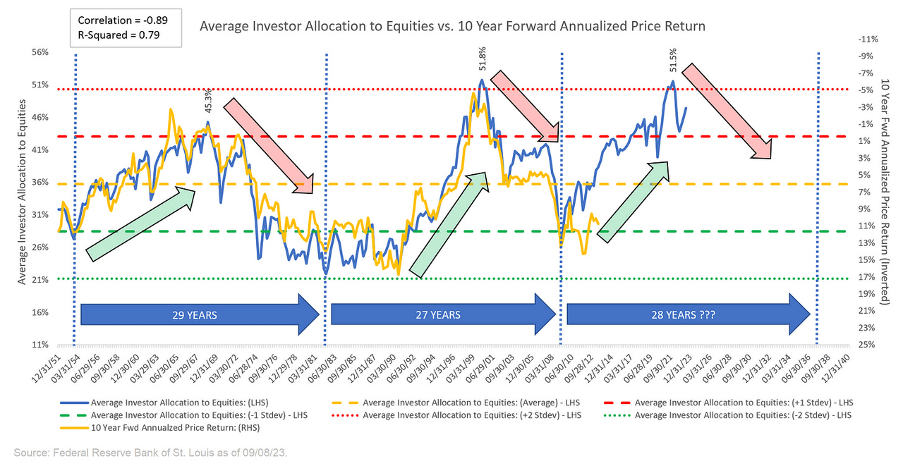
Note in the chart above that I have used green/red arrows to denote up/down trends for the Average Investor’s Allocation to Equities and subsequently the returns that followed those periods. Here is what those same periods look like when we chart the S&P 500. Note: the grey vertical bars represent US recessions.
TradingView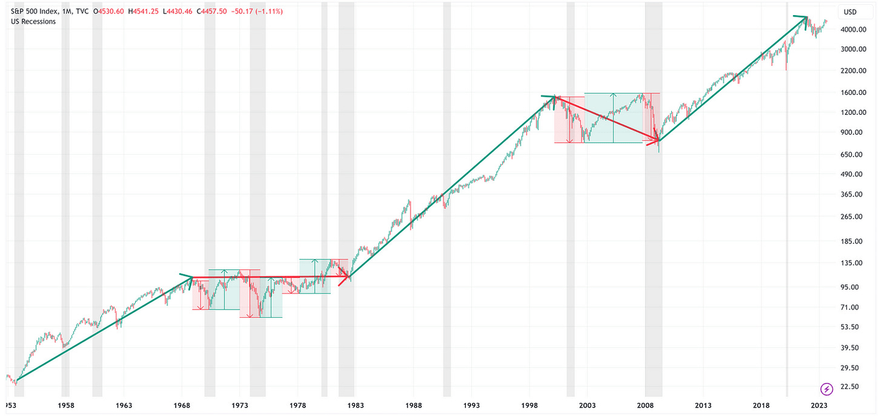
The immediate takeaway is that during the “green arrow” periods, you can pretty much close your eyes, go long the S&P 500, and you will fare quite well.
Alternatively, the “red arrow” periods are a bit more challenging and typically end with a sideways or negative return. With that said, note that during the “red arrow” periods, it is not uncommon to have “very dramatic sell-offs followed by very dramatic rallies” as I noted above.
Where are we now?
We are in the “red arrow” period; therefore, as noted above, over the next 10 years, we should expect a return of approximately -0.73% on an annualized basis. Coupled with that will likely be a recession or two and some dramatic selloffs associated with those recessions, but some equally dramatic rallies on the backside of those recessionary periods.
The million-dollar question is: “When are we going to have a recession and one of the selloffs you mentioned?” The honest answer is that I don’t know but then again, neither does anyone else. The best we can do is to make an educated guess based on historical relationships and plan accordingly while at the same time realizing that you never want to have all of your eggs in one basket assuming only one outcome is the only possibility.
To that end, I would encourage you to read the piece I wrote last week which talks about the clues that the recent rise in the Unemployment Rate may provide as it pertains to when to expect the next recession. You can find it here.
“Red Arrow” Periods
The two “red arrow” periods noted above occurred during the following time frames:
-
December 1968 – December 1982
-
March 2000 – March 2009
Using regression analysis based on the relationship between the Average Investor Allocation to Equities and the subsequent 10-year return for the S&P 500, we can create a “fair value” model for the S&P 500. If we look at the S&P 500 vs. the “fair value” model during the “red arrow” periods, we find that during each of the “dramatic sell-offs”, the S&P 500 declined well below its “fair value” model price.
December 1968 – December 1982
Author Created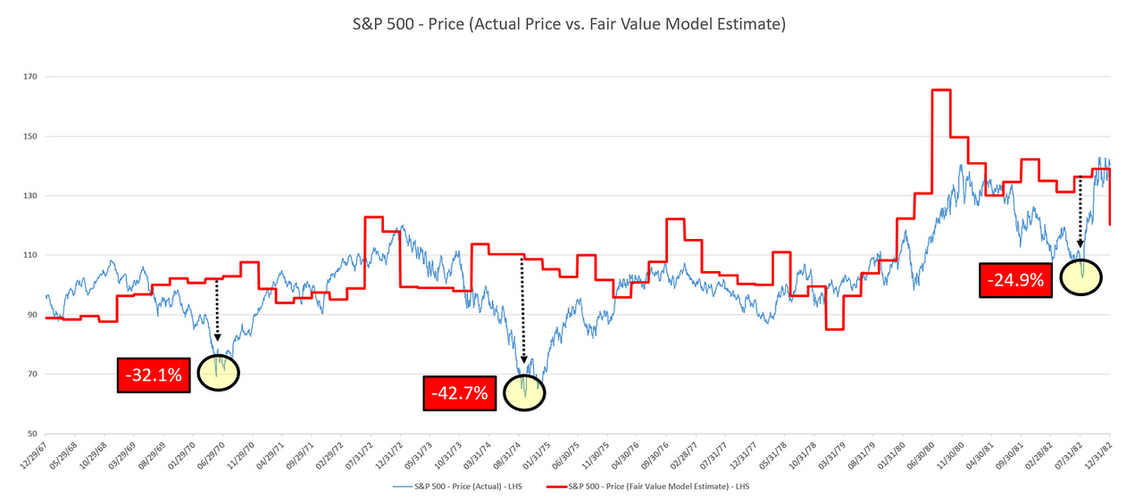
March 2000 – March 2009
Author Created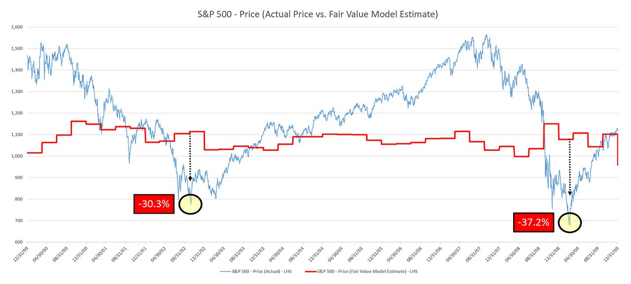
Interestingly, the average decline below the “fair value” line for the December 1968 – December 1982 period was -33.2% while the average decline below the “fair value” line for the March 2000 – March 2009 period was -33.7%. Pretty similar.
How does this compare to today’s market?
Over the last decade or so, the S&P 500 has spent a lot of time well above “fair value” but did trade back to it (or close to it) on two occasions: December 24, 2018 & March 23, 2020. As you can see below, on December 24, 2018, the S&P 500 traded to +2.6% above its “fair value” line before reversing course, and then on March 23, 2020, the S&P 500 traded to -6.4% below its “fair value” line before reversing course.
Author Created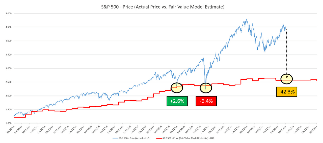
In the previous two “red arrow” periods, the S&P 500 traded to an average of -33.5% below its “fair value” line. Personally, I don’t think that is possible in this modern era, as I think the Fed would step in well before that to stabilize markets.
With that said, I do believe that it is possible for the S&P 500 to trade down to the current “fair value” line during the next recession.
From Friday’s S&P 500 close (4,457) to the current “fair value” line (2,570), that would suggest a decline of -42.3%. While this seems like a large decline (and it is), it is worth noting that the S&P 500 at 2,570 doesn’t take out the low of 2018 (2,351) or the low of 2020 (2,237) which I think would be palatable for the Fed before stepping in to backstop the market.
What should I do now?
As the old saying goes, “History never repeats itself, but it often rhymes…”. This would suggest that it may be prudent to look at what worked well in 2018 and 2020 and consider doing some of the same in the current environment.
Outside of 2022, when the market was in “turmoil”, investors tended to flock to US Treasuries. The PIMCO 25+ Year Zero Coupon U.S. Treasury Index ETF (ZROZ) and the iShares 20 Plus Year Treasury Bond ETF (TLT) are two ETFs that immediately come to mind when thinking about US Treasury-based investment vehicles. Let’s see how they performed in 2018 and 2020.
2018 Scenario
-
S&P 500 = black line.
-
ZROZ = red line.
-
TLT = blue line.
TradingView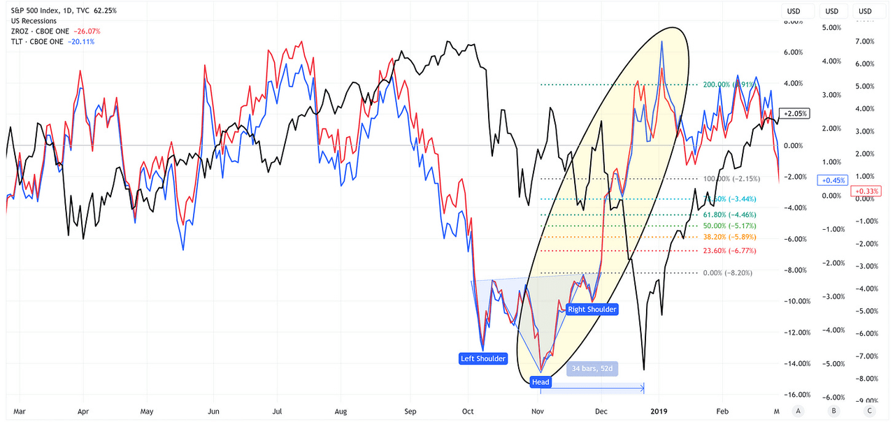
Note that ZROZ and TLT had very similar returns and both reached well above the 200% target assigned based on the inverse head & shoulders that had formed.
2020 Scenario
TradingView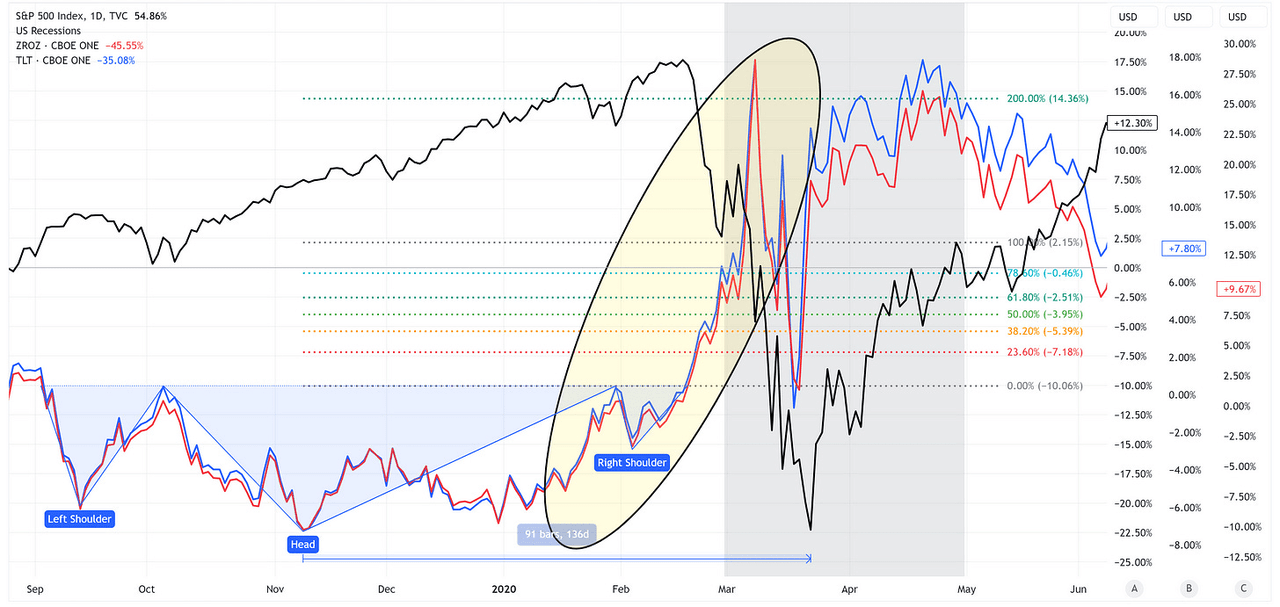
While the inverse head & shoulders pattern isn’t as pretty in this scenario, the result is the same, as both ZROZ & TLT achieved their 200% target based on the inverse head & shoulders pattern.
Fast forward to today.
ZROZ
TradingView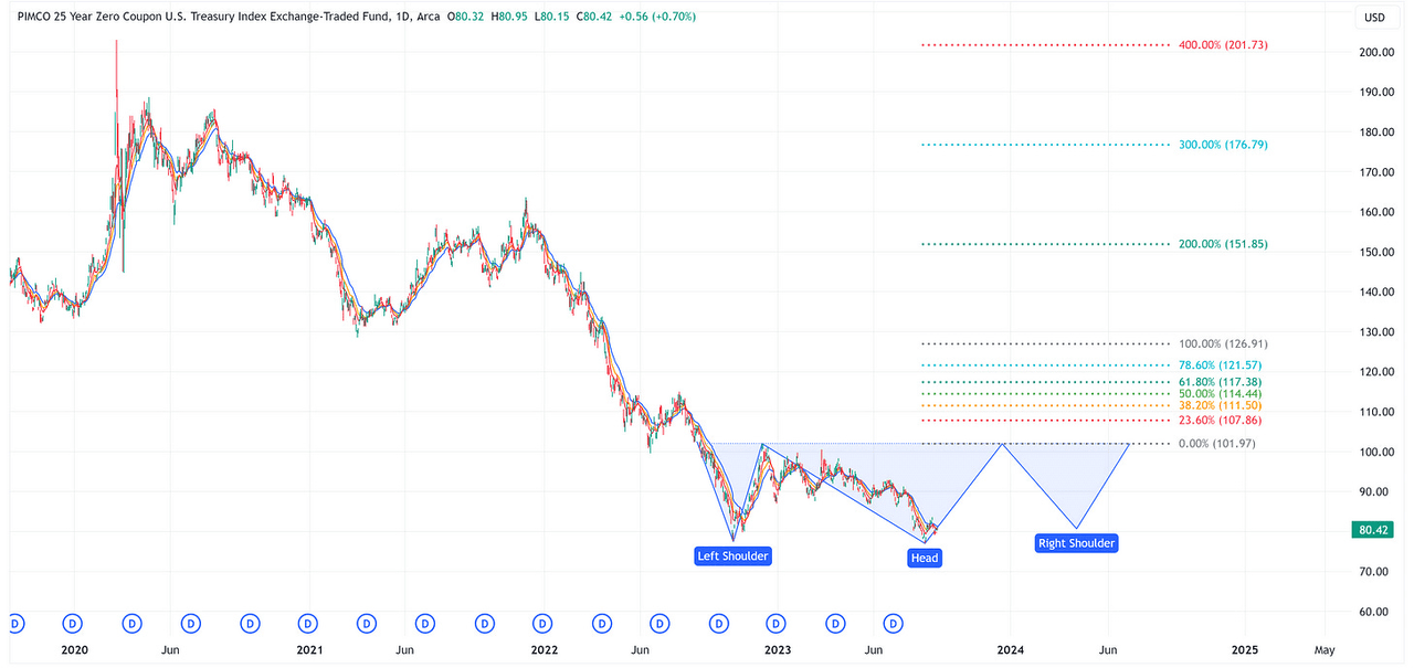
TLT
TradingView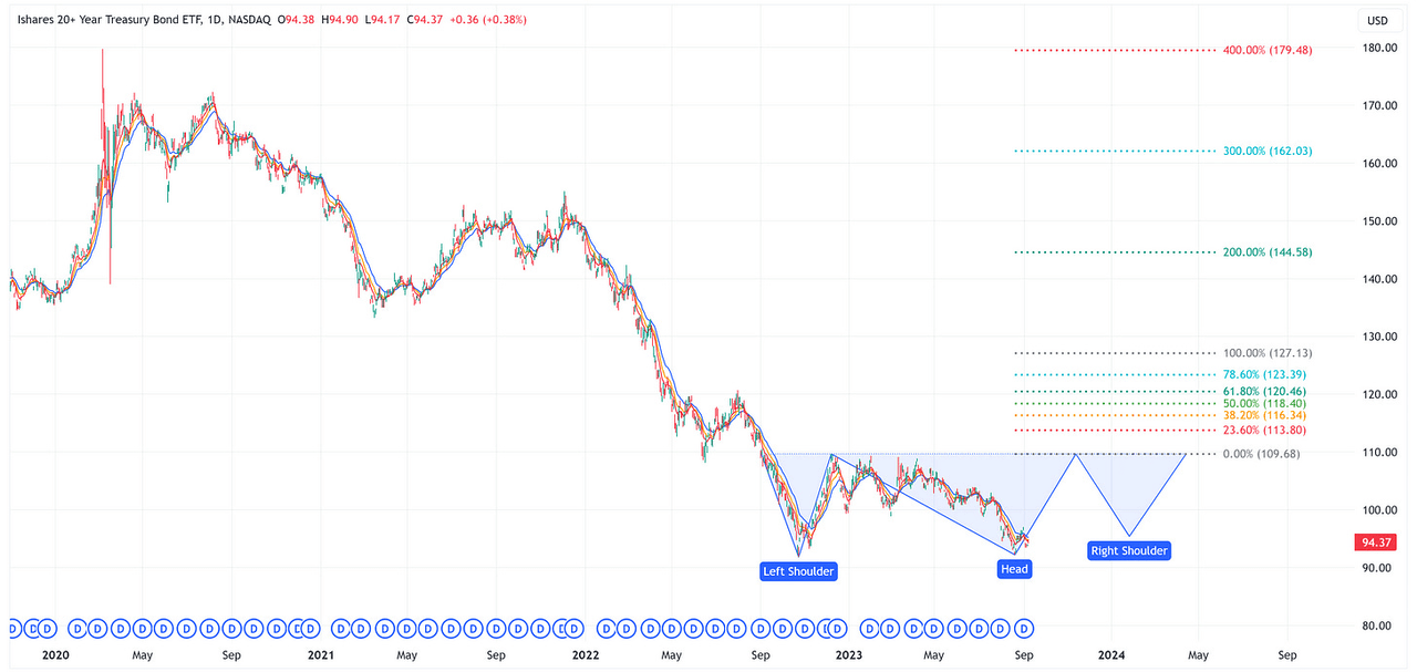
Is it possible that both ZROZ and TLT are in the process of forming an inverse head & shoulders? Only time will tell. Anecdotally, I find it interesting that the 400% target for both ZROZ and TLT lines up exactly with the 2020 highs for each ETF.
For grins, let’s suggest that ZROZ and TLT are in the process of forming an inverse head & shoulders and further, let’s hypothetically suggest that they each achieve their 200% target as they did in 2018 and 2020. This would suggest a move from 80.42 to 151.85 (+88.8%) for ZROZ and a move from 94.37 to 144.58 (+53.2%) for TLT all while the S&P 500 is in the process of potentially declining by -40% or so. Let me be abundantly clear, I am not suggesting that you buy ZROZ or TLT, I am simply pointing out relationships that have occurred in the past.
Further, if ZROZ and TLT are in the process of forming an inverse head & shoulders, this would suggest that they still need to trade up to the neckline and then lower from there to form the right shoulder. That will likely be a painful ride for those who are involved and may take longer than you care to wait.
I do not have a crystal ball and the future most certainly will differ in some degree from the past. With that said, consider this food for thought.
Bad News = Good News?
My guess is that some people are going to read the previous commentary and be upset that I didn’t warn them in advance to remove any and all sharp objects from arm’s reach. Please know that my intent is not to create a “doom and gloom” piece but rather to prepare investors for what I believe is a highly probable outcome at some point over the next several years.
When the S&P 500 reaches its “fair value” (or close to it), it is going to kick off a generational buying opportunity. Would you rather ride the S&P 500 all the way down to 2,570 (-42.3%) and have substantially less “dry powder”, or does it make sense to use at least a portion of your portfolio to do something that has the possibility of adding to your “dry powder”?
It always comes down to timing. Too early and it feels like you’re wrong, too late and you missed the move; therefore, the best course of action may be to do something, but not everything all at once.
Read the full article here


