I hope everyone had a great Labor Day weekend!
Let’s jump right into this week’s newsletter.
On Friday of last week, the US economic releases contained two of the more important monthly releases – 1) the Change in Nonfarm Payrolls and 2) the Unemployment Rate.
The Change in Nonfarm Payrolls came in at 187k vs. expectations of 170k while the Unemployment Rate came in at 3.8% vs. expectations of 3.5%.
The Nonfarm Payrolls number was 17k better than expected but the previous month was revised down by -30k to 157k. However, when you look at the Nonfarm Payrolls over a two-month period it was largely in line with expectations so not ultra-newsworthy in my opinion.
Unemployment Rate – What is it telling us?
Where I’d like to focus today is on the Unemployment Rate of 3.8%. This was the highest Unemployment Rate since February 2022 which was also 3.8%. The reality of the situation is that a 3.8% Unemployment Rate is still indicative of a very healthy economy.
With that said, the “issue” isn’t the 3.8% Unemployment Rate itself, but instead, the change in the number and specifically, where the current 3.8% is relative to its 18-month moving average.
In the chart below, I have graphed the Unemployment Rate (blue line) vs. its 18-month moving average (green line). The red vertical bars denote US recessions.
TradingView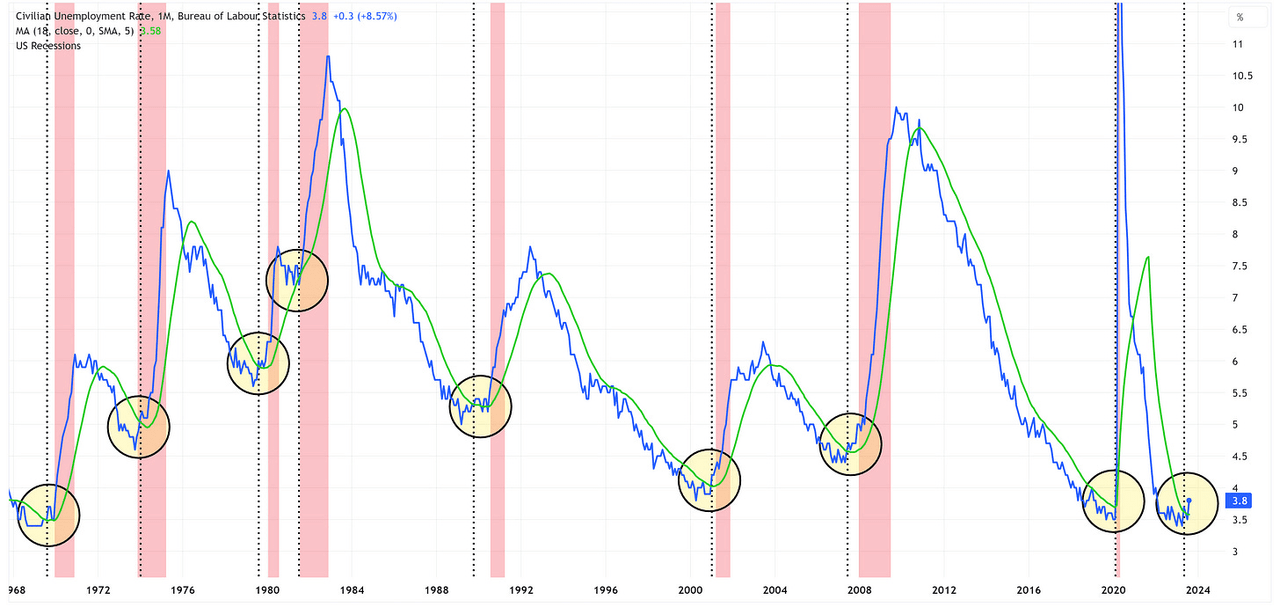
If you examine the chart closely, you’ll notice that each time the Unemployment Rate has had a sustained move “up and through” its 18-month moving average, we have had a recession begin within the next three quarters. I have highlighted these occurrences with yellow circles.
Further, I have added vertical black dashed lines which denote when the Unemployment Rate moved “up and through” its 18-month moving average. If we look at these vertical black lines relative to the start of the subsequent recession, we find that there really isn’t a consistent time interval between the “warning signal” (i.e., the Unemployment Rate moving “up and through” its moving average) and the start of the next recession.
The range of outcomes over the course of the previous 8 recessions is anywhere from 0 months to 9 months of “advanced notice” with an average of 3.25 months and a median of 3.00 months.
It is worth noting that there have been a couple of instances where the Unemployment Rate moved above the 18-month moving average, fell back below the 18-month moving average, and then moved above it again. For my calculations, I used the first time the Unemployment Rate moved above its 18-month moving average to measure the timespan until the next recession.
Where are we today?
The Unemployment Rate first moved above its 18-month moving average 3 months ago with the 3.7% print in May of this year. We subsequently moved back below the 18-month moving average and we’re now back above it again.
By historical standards, we are effectively at the average/median time frame of 3.25/3.00 months which would suggest that a recession could be imminent. Alternatively, if we were to use the 9-month maximum timespan figure noted above, it would suggest that a recession could still be 6 months away or maybe something truly is different this time and we won’t have a recession at all. Only time will tell.
It’s important to remember that no one rings a bell and tells us that a recession has begun. The National Bureau of Economic Research (NBER) is responsible for determining when a recession begins/ends and they often make this determination well after the recession has begun and sometimes even after the recession has already ended.
The classic example was when the NBER came out in December of 2008 and told us that the US was in a recession and that the recession began in December 2007. For those of us who lived through the “Global Financial Crisis”, it was painfully obvious that the US was in a recession well before the NBER declared it so in December 2008.
My point here is that we shouldn’t wait for the NBER to tell us that we’re in a recession, the market has a way of doing that for us well before the NBER and I’m suggesting that using the Unemployment Rate vs. its 18-month moving average is a good tool to have in your toolkit towards this end.
In the following charts, I’m going to go back and zoom in on the previous eight recessions so that we can get a sense for what the market was telling us, and when, relative to where the Unemployment Rate crossed “up and through” its 18-month moving average.
Let’s start with a table that summarizes the results and then we’ll move into the charts.
Author Created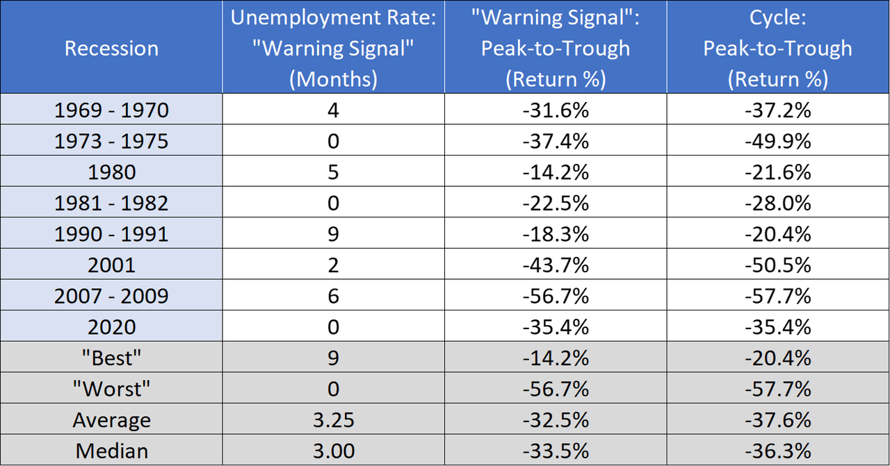
In the following charts, please note the following:
-
The price range denoted in red equates to the “Warning Signal”: Peak-to-Trough (Return %)” in the table above.
-
The price range denoted in blue equates to the “Cycle: Peak-to-Trough (Return %)” in the table above.
-
The vertical black dashed line is where the Unemployment Rate moved “up and through” its 18-month moving average.
-
The vertical red bars are US recessions.
Recessions: 1969 – 1970 & 1973 – 1975
TradingView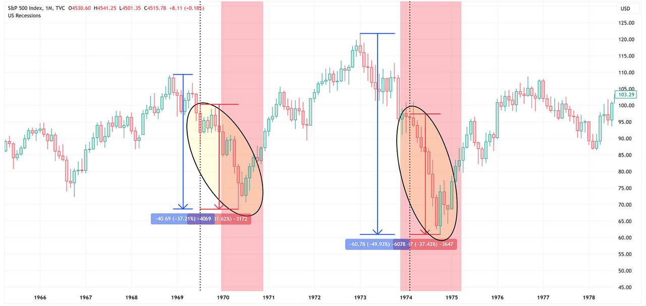
Recessions: 1980 & 1981 – 1982
TradingView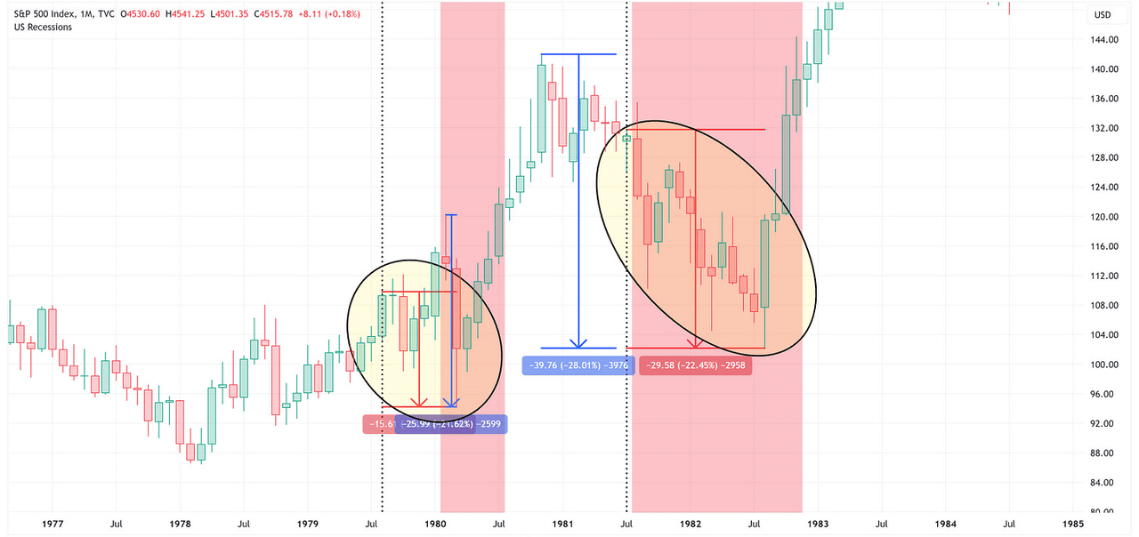
Recession: 1990 – 1991
TradingView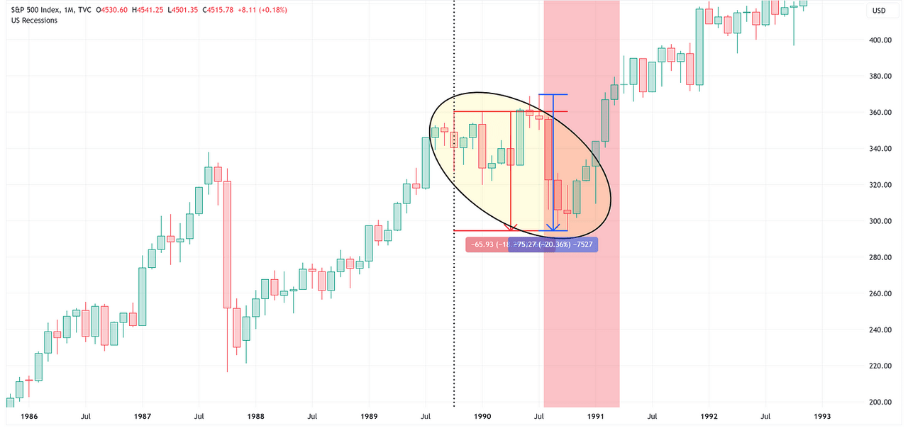
Recessions: 2001 & 2007 – 2009
TradingView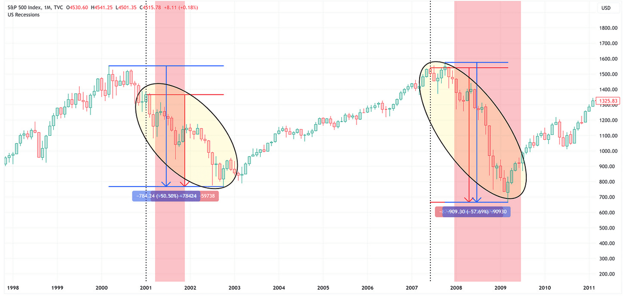
Recession: 2020
TradingView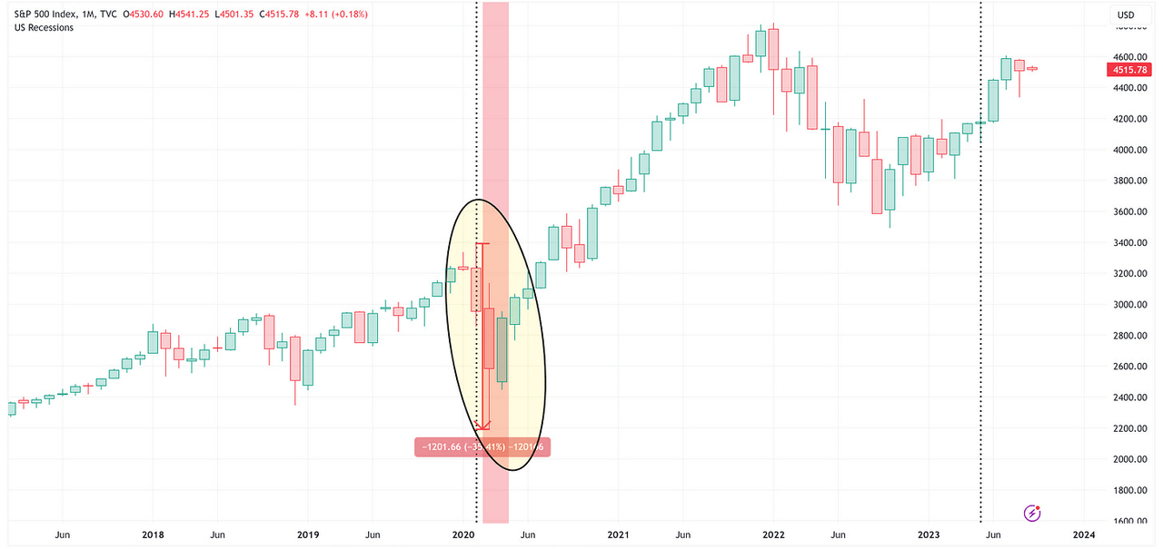
Takeaways
Just because a recession has occurred in the past after seeing the Unemployment Rate move “up and through” its 18-month moving average does not necessarily mean that it is guaranteed to happen again. However, for argument’s sake, let’s suggest that it does happen again. What would that mean for the S&P 500?
If we use the average value (-32.5%) from our “Warning Signal”: Peak-to-Trough (Return %)” column in the table above, that puts the S&P 500 target at 2,856 or -36.8% lower than Friday’s closing price which I am showing in the chart below with the price range denoted in black. My sense is that the “no landing” crowd is not even considering this as a possibility.
TradingView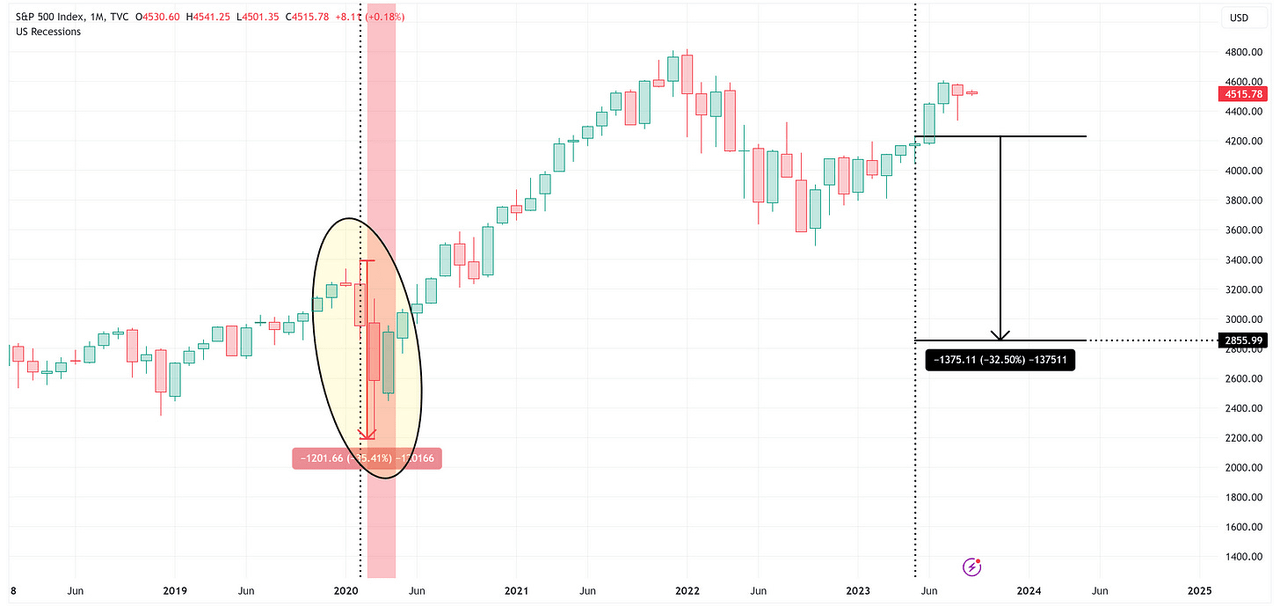
Absolute Value & Relative Value
Here are the weekly updates for my absolute value and relative value charts.
Absolute Value
Author Created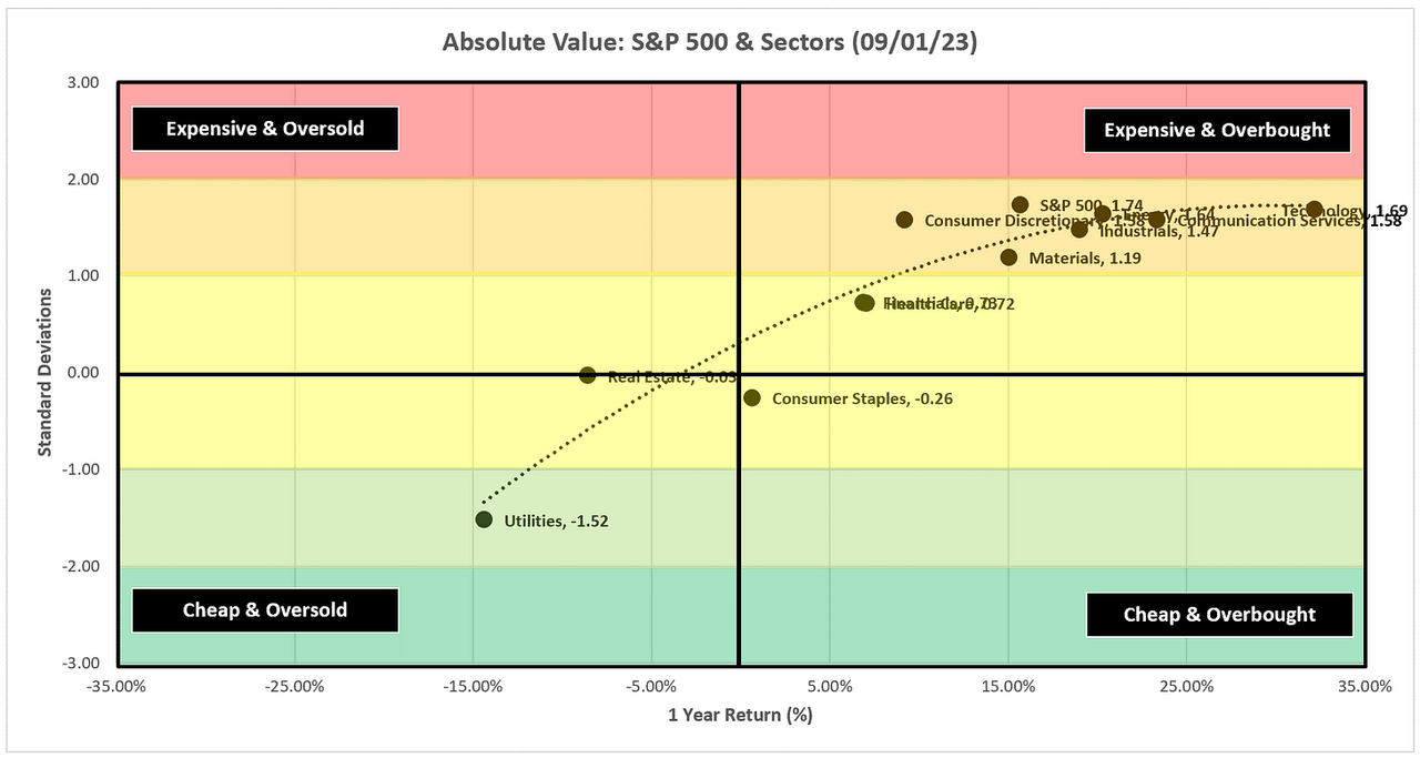
Six sectors, and the S&P 500, remain above +1.0 standard deviations and firmly in the “Expensive & Overbough” quadrant.
Author Created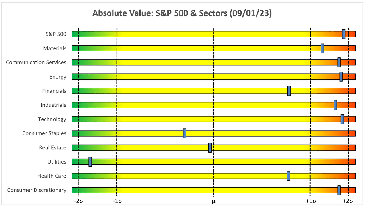
Relative Value
Author Created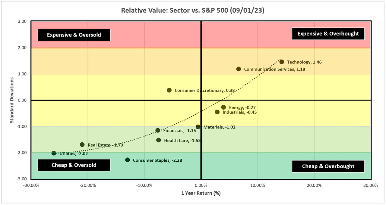
Relative to the S&P 500, Technology and Communication Services continue to drive the bus this year while six sectors remain below -1.0 standard deviations, two of which are beyond -2.0 standard deviations.
Author Created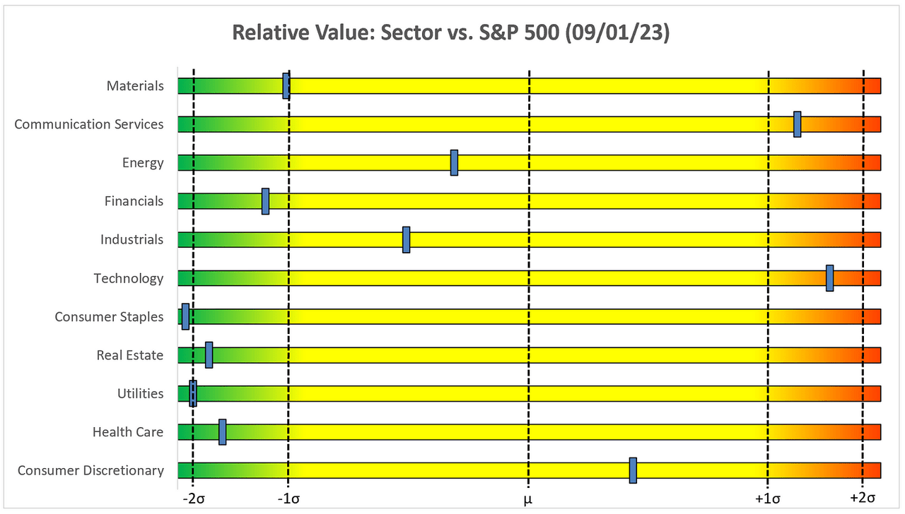
Sector Review
A quick note on how to use the following charts:
-
The goal of these charts is to keep you on the right side of the trade.
-
Very simply, you would want to be long when the price is above the green trailing stop loss line, and you would want to be short (or out of your long) when the price is below the red trailing stop loss line.
-
Additionally, I like to layer in some technical analysis to help determine if we think the S&P 500, or a sector in particular, has more room to run or if it is close to flipping from “green to red” or vice versa.
-
-
Unless otherwise noted, I use weekly charts because it removes some of the noise from the daily charts.
-
I will typically make a comment or two about the chart as needed to provide additional clarification as to how I’m looking at the chart.
-
The goal is not to be “bullish” or “bearish” but to simply asses what the chart is telling us and try to determine what the highest probability outcome is over the short-to-medium term.
S&P 500 Index
TradingView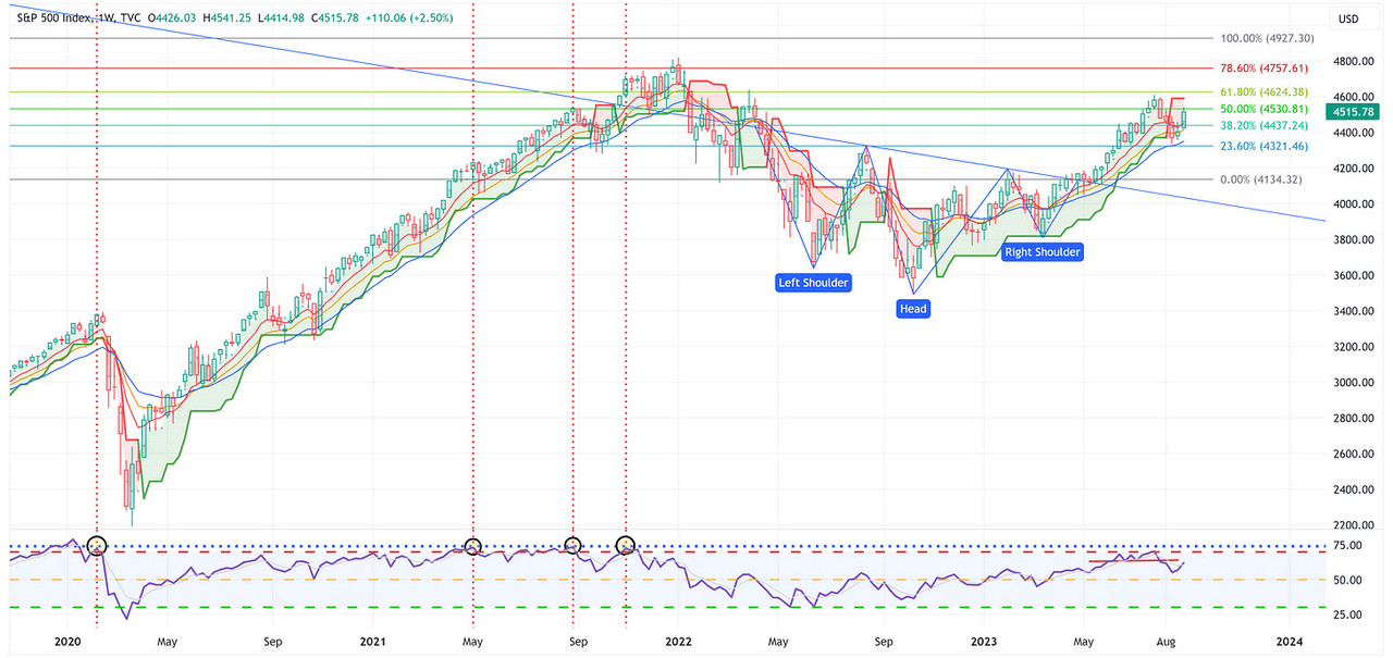
-
The S&P 500 had a solid week last week and closed above the 8, 13, and 21 EMA’s, which is a net positive. It still needs to break through the red trailing stop loss line to take the next leg higher and towards the target of 4,927.
Technology
TradingView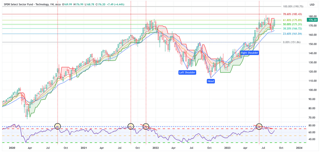
-
Similar to the S&P 500, XLK had a great week and closed above the 8, 13, and 21 EMA’s, which is a net positive. Again, similar to the S&P 500, for XLK to take the next leg higher, and towards its target of 190.75, it’s got to break through the red trailing stop loss line.
Communication Services
TradingView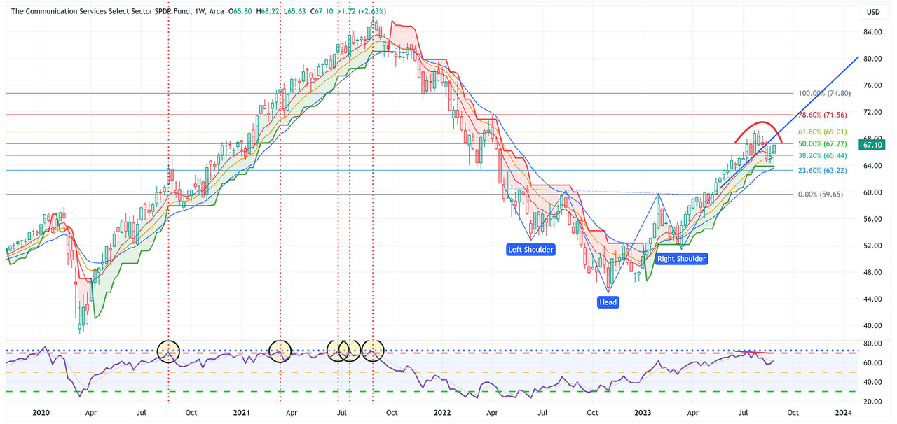
-
We have talked for a couple of weeks about the possibility of a “rounding top”. This still may be the case and note how XLC ran right into the blue trend line and bounced lower off of it. It needs to break up and through this line for it to have a shot at the target of 74.80.
Consumer Discretionary
TradingView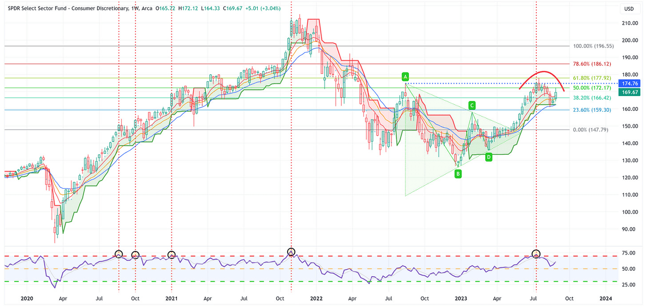
-
Note that XLY has had a similar “rounding top” pattern of late. Further, note how it touched the 50.0% Fib and was rejected lower. With that said, XLY remains above the green trailing stop loss line which is a net positive but it needs to clear 174.76 to have a shot at the 196.55 target.
Industrials
TradingView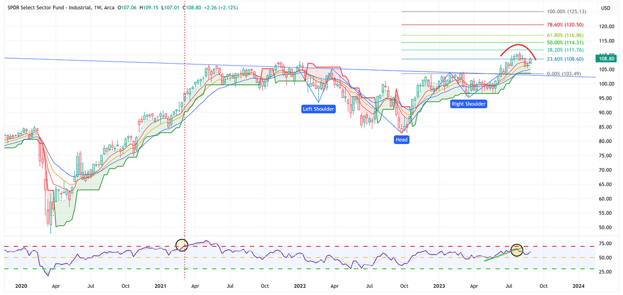
-
Same song as the previous sectors, possible “rounding top” but a solid week to boot and it remains above the green trailing stop loss line. XLI needs to clear the previous high from a few weeks ago to have a shot at the 125.13 target.
Materials
TradingView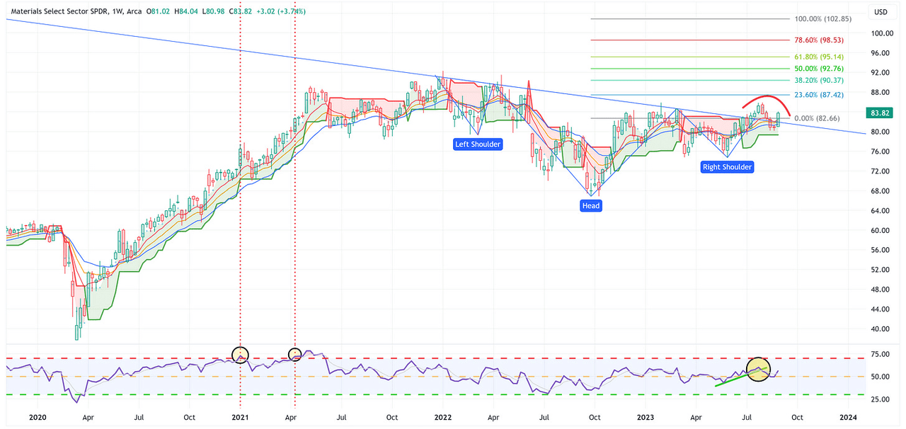
-
Strong week for XLB and note the decisive move higher on the RSI. XLB needs to clear the highs from a few weeks ago to make me a believer that this thing taking a substantial move higher toward the 102.85 target.
Energy
TradingView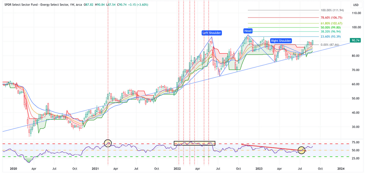
-
I continue to see this as a “busted H&S pattern” which means the target is 111.94. Note how XLE continues to bounce off 87.66, it’s above the green trailing stop loss line, and the RSI is moving higher…what’s not to like?
Financials
TradingView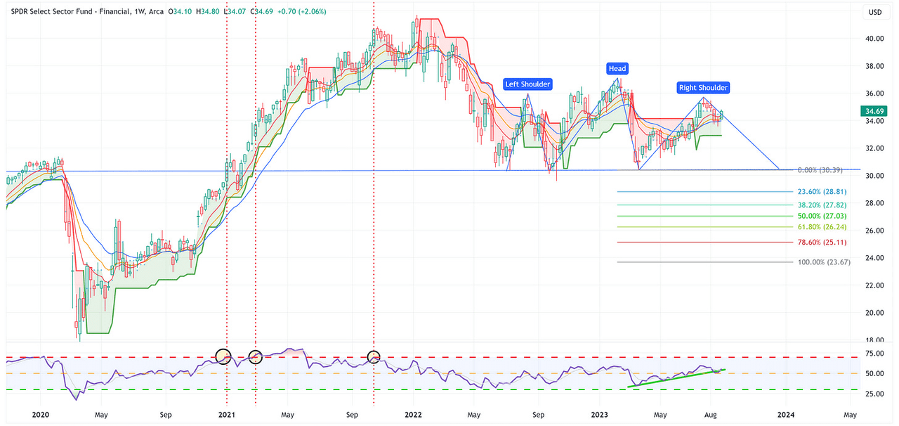
-
I continue to believe this is a Head & Shoulders pattern that wants to form but it continues to do everything it can to deny this thought. For now, RSI continues to move higher, XLF remains above its green trailing stop loss line and it closed above each of the EMA’s. That’s a pretty solid setup to continue moving higher.
Real Estate
TradingView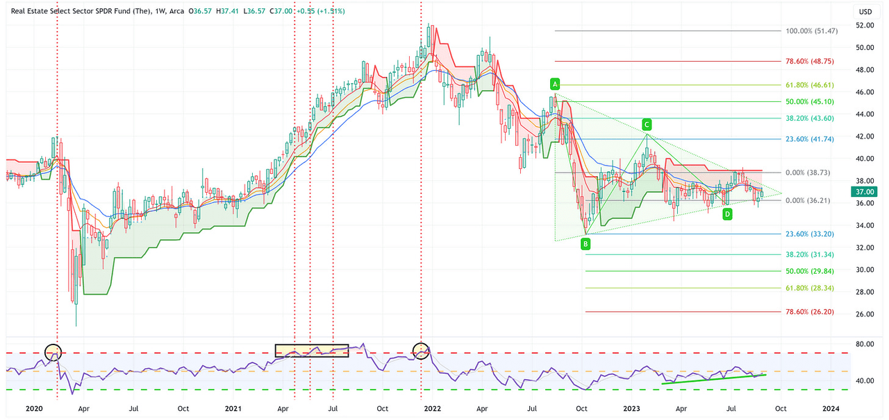
-
I’m not sure XLRE even knows what it wants to do at this point. The good news is that one way or another, the triangle pattern will be resolved within the next 3 – 4 weeks. Once that is decided, we’ll have a better idea of which way this wants to go over the medium term.
Consumer Staples
TradingView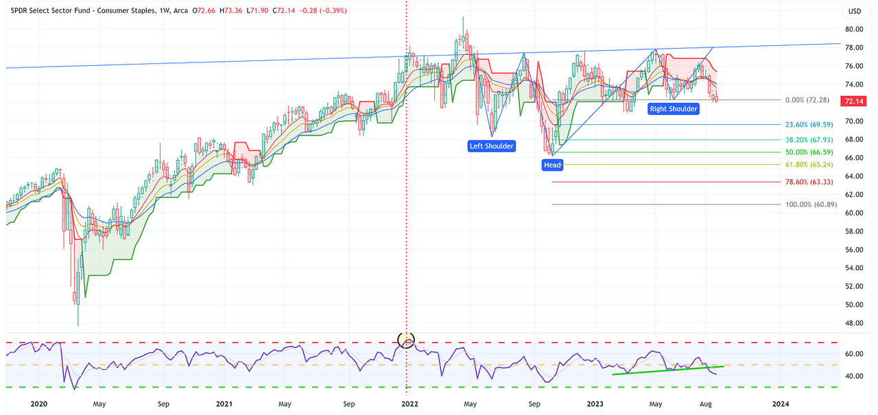
-
XLP is on the verge of becoming a “busted inverse H&S pattern” which would call for a target of 60.89. The price is below the red trailing stop loss line and the RSI is in bad shape. A close below 70.85 and I think this picks up steam to the downside.
Utilities
TradingView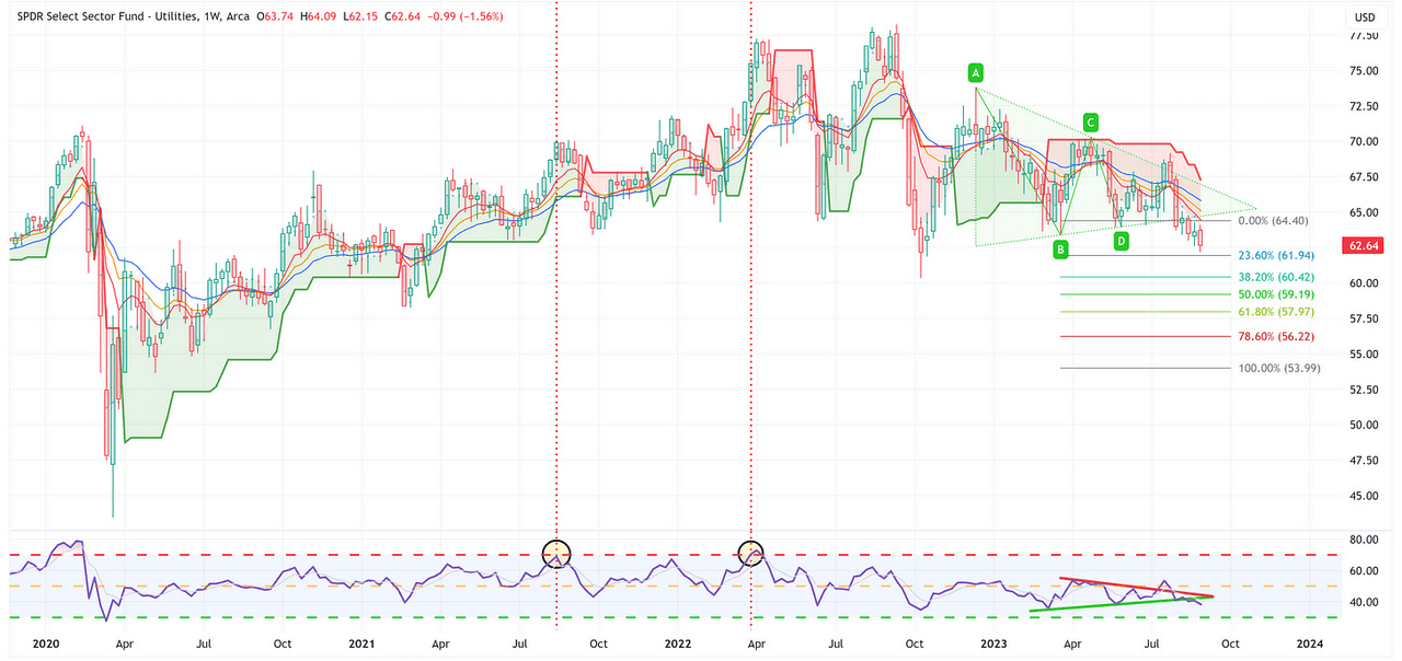
-
XLU has busted its triangle pattern suggesting a target of 53.99. It also remains below the red trailing stop loss line and the RSI is breaking lower. Net/net, not a good look (if you were bullish XLU).
Health Care
TradingView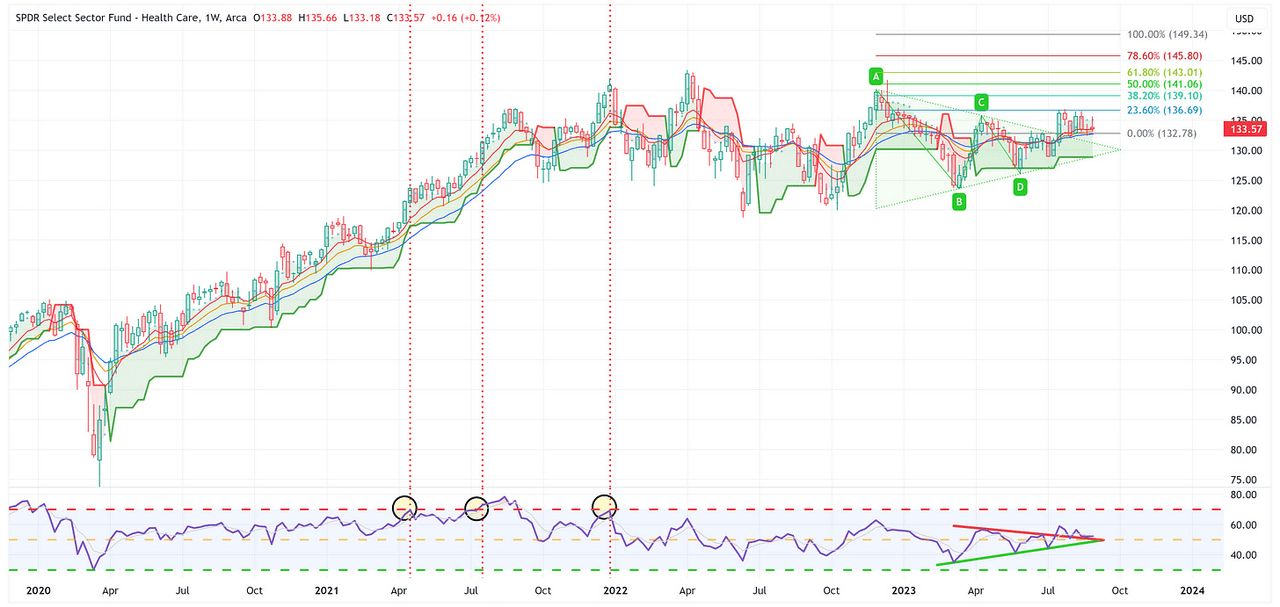
-
Despite the fact that XLV has broken out of its triangle pattern, it feels like it is in the process of consolidating. The current target is 149.34 but I’d like to see XLV break above 136.69 to gain more confidence in this moving significantly higher.
Summary
The S&P 500, and several sectors, put in a really strong week last week. With that said, I think the Unemployment Rate, and its move above the 18-month moving average, is a very important situation to watch.
If history repeats itself, it would suggest that a recession is six months or less away and that the S&P 500 is going to decline by over -30% over the medium term.
Given that we don’t have a crystal ball, it’s impossible to say what will actually happen next but would you thank yourself 6 – 9 months from now if you took a few chips off the table today?
Until next week…
Read the full article here


