What’s New…
Let’s take a minute to look at the May employment report and try to decide what happened that caused Wall Street to be set back on its heels and for so many to suddenly think that the economy really is stronger than they expected and that it would remain more resilient and that would make the Fed not amenable to a rate cut by the end of the year as the market had been thinking previously. What changed their minds?
Surprises and offsets
The prime suspect in the release of the data was the 339,000 payroll jobs created in May: there were also upward revisions to the previous months, making that gain even more of a sting than had been expected. However, over the years I have tried- and I guess largely failed- to get people to treat the hours-work data as a superior headline to the one involving the number of jobs created. To an economist what’s important are the labor services used by the economy. You can take an existing worker and work him twice as long or you can work that worker the same number of hours and add another one. In both cases you get the same number of hours-worked. The hours worked data encompass both the number of people on the payroll and the average amount of time that they worked during the period. In May hours-worked fell by 0.1% this is despite adding 339,000 workers. That’s a surprising result and an offset to the gain. It’s also true that the average hourly earnings that economists prefer (the measure excluding supervisory workers) rose by 0.5% which is rather strong, and that series is up by 5% year-over-year. However, in the separate report on jobs known as the ‘household report’ 310,000 jobs were shed and that was after adding only 139,000 jobs in April (but there were 577,000 household jobs added in March). The payroll report adds 283,000 jobs per month over the last three months while the household report adds only 135,000. The payroll report adds 339,000 jobs per month over the past year while the household report adds 202,000 per month on average.
The usual cross currents
There were a lot of cross currents in the May report and no reason to jump in with two feet with economic optimism or Fed rate cut pessimism, but that is exactly what markets did. More surprisingly, they did it as the unemployment rate jumped to 3.7% from 3.4% the month before. The unemployment rate was last at 3.7% in October of 2022; it was last higher than 3.7% in February of 2022. By the standards of this economy that’s a relatively high rate of unemployment compared to what we’ve been seeing. And yet markets seem to have pushed this development completely aside.
Do you keep the pits and toss the cherries or vice versa?
When making forecasts it’s almost always true that there’s some contrary information that must be dealt with. It is common practice to take a piece of rogue data, look it in the eye, and find some reason to diminish it, deprecate it or deny it (those are the “3D’s” of moving on). For example, the unemployment rate might be revised next month. However, as a rule apart from large scale definitional changes or survey changes unemployment rates are not very prone to being revised and just as importantly unemployment data are not particularly volatile.
Monthly job data are fickle
As economic statistics go the monthly household and payroll reports on jobs speak with forked tongues. However, the unemployment rate is a straight shooter and rarely wrong-foots you. It can surprise you but it won’t whip-saw you. That’s an even more important feature to bear in mind when you realize that the unemployment rate doesn’t rise by 0.3 percentage points month-to-month very often. If this were “Lost in Space,” the robot would be screaming, “danger Will Robinson, danger, danger.”
Chart 1
Month-to-month changes in the unemployment rate of 0.2% or more (Haver Analytics and FAO Economics)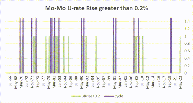
Green bars and purple bands tell the story
The green bars in this chart are interspersed with the purple bands that identify recession periods since the mid-1960s. What should stick out on this chart is how these green bars cluster around the purple bands and how few of them stand in isolation between recession periods by themselves. Depending on how you want to count them, I cite approximately 5 bars (excluding the one for May 2023) that are not associated with recessions. This is interesting because this is just a very simple presentation of month-to-month changes. There’s nothing special here in trying to create a signal out of this. I’m just making the point that there are only five-times since the mid-1960s that we had an increase in the unemployment rate in a single month of 0.3% or more and when the economy was not in recession, going into recession or just coming out of one. Chart 1 is a very simple very powerful chart – nothing up my sleeve, no fancy variable transformations.
A (not so) Fancy variable transformation
The chart below poses a very minor transformation on the data to create this impeccable recession diagnostic. I create a series out of the U3 unemployment rate and create a signal consisting of every time the U3 unemployment rate rises by more than 0.5 percentage points from its 12-month low. To create this series you need to calculate the 12 month minimum for each month and then compare it to the actual unemployment rate; if the gap is more than 0.5 percentage points it’s a recession signal (here that is 0.5). It’s never been wrong- at least back to 1960.
Chart 2
Recession signaling (Haver Analytics & FAO Economics )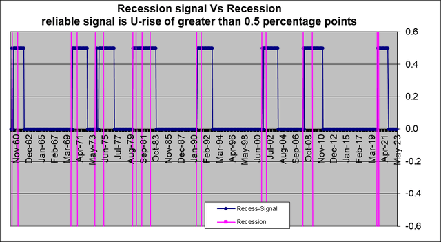
In view of the excellence of the signaling value of just a 0.3% increase in the unemployment rate it’s not surprising that something with just a little bit more substance performs so much better.
What we are headed for…
You may be aware of something called the Sahm rule. According to that rule a recession is signaled when the three-month moving average of the unemployment rate rises by 0.5 percentage points or more relative to its 12-month low. However, I’ve been using this signal with just the ‘greater than 0.5% rule’ for some time applied to unaveraged (raw) data. The problem with this metric is while it diagnosis recessions without error it does not give advance warning. Only one recession over this period was signaled as a recession before it started by this rule at least according to the official NBER imposed recession bands.
This is yet another reason look at other conditions in labor markets that might be signaling recession because while I do like economic measures that are diagnostic (because it is nice to know what’s going on in real time) it’s even better if we have something that will be predictive and will tell us that a recession has started before it has actually started.
Context!
To put this article in context you can see that I am writing about things that signal coming recessions although I started out talking about how the market is seeing much greater resiliency in the economy. This is what confuses me. I have written other articles on Seeking Alpha where I have spoken about how the markets aren’t looking for the funds rate to go high enough how there’s too much complacency about how little the Fed will have to do to control inflation. For months and months markets have just been ignoring all of the economic resiliency and they’ve continued to look for the funds rate to get cut before the end of the year. And now – after all my contrarianism – I am the one who is starting to talk about the potential for the economy to weaken ‘faster’ and being critical of the market that has finally gotten religion over economic resilience.
The real story is…
Tell me the economic story is much less a story about economic resilience and much more a story of how fast the inflation rate will come down and I will believe that. Resilience will be related to the stickiness of the inflation rate but it won’t be the only factor that the Fed will have to consider. And we continue to get reinforcing data telling us that inflation has been sticky and that it probably is not going to come down as fast as the Fed would like; it certainly is not going to come down as fast as the market previously had thought that it would. And maybe that’s what’s caused the markets to rethink this view of Fed as cutting rates before the end of 2023. Maybe it’s just easier to change that view under the rubric of economic resiliency than to talk about inflation being stubborn. But it was linked to the employment report… My change in view stems from data: a 0.3 percentage point rise in the U3 rate.
Why the unemployment rate is important
Chart three offers another view of changes in the unemployment rate to help put what’s going on in perspective. That chart shows the distribution of changes of various sizes in the month-to-month unemployment rate since 1960. Over 25% of the time the unemployment rate is unchanged month-to-month. It really is a static variable. Then another 27% of its values lie either one-tenth of a percentage point higher or lower. And another 30% of observations are two-tenths of a percentage point higher or lower. That totals 84.5% of the observations that are either unchanged or within one tick or two ticks of the unemployment rate of the previous month. The three tenths of a percentage point gain that we saw in May occurs only 2.9% of the time and markets dismissed it.
Chart 3
Frequency distribution of monthly U3 changes (Haver Analytics and FAO Economics)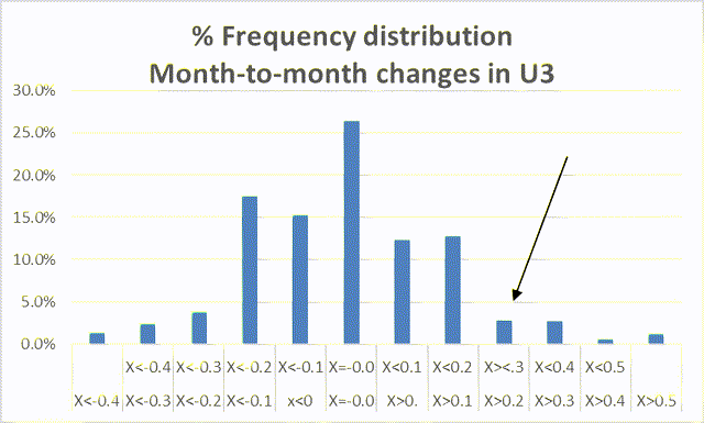
Chart 4
Over of six months of U3 data, the number of months that the current U3 rate exceeds (Haver Analytics & FAO Economics)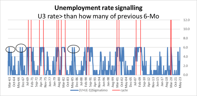
Other ‘stupid’ economist tricks
Another approach might be to look at how high the unemployment rate is compared to a string of previous months. Here we create a series that counts back six-months and tallies how many months out of six that the current unemployment rate exceeds each. When the unemployment rate has been higher than it was in each of the previous six-months, that creates a signal that identifies each past historic recession and a time series of data that creates what appears to be only about three false signal episodes one in 1963, a pair of them in the late 1960s and a pair in the mid-1980s.
In fact, in 1969, 1979, 1990, 2001, 2007, and 6-months before the recession in 2020 this metric produces ‘recession signals’ that predate the onset of recession. It has the advantage of being early, but it has the disadvantage of creating some false signals. It only fails to predate the 1973-75 recession, but it does diagnose it. It is predicting recession as of May of 2023.
The unemployment rate is a particularly good vehicle for predicting recessions because it is so stable, and it moves in such deliberate ways. The yield curve has also been a good diagnostic for recession but its timing and relationship to the recession is often more uncertain and in the late 1960s it also had one false signal.
The outlook, as always, is speculative
I am exactly like everyone else on Wall Street: I have no idea what the future is going to bring. However, I try to have views that are grounded in some reliable economic data and processes to help guide me in the prediction process. At the end of 2021 with almost no guidance from data I began arguing that we would have a recession for sure because to me the extremely low federal funds rate, the surging inflation rate, and the low long term interest rates suggested to me that the economy was in a bad place and it was going to take a lot of work on the part of monetary policy to (1) catch up to inflation and get interest rates as high as they needed to be to control it, and (2) convince markets that the Federal Reserve was going to have the backbone to do what was necessary. With markets capitulating to the Fed ‘forecast’ (…known as ‘The Dots’) the Fed is no longer expected to be cutting interest rates in 2023, markets now appear to be won-over. And now some of the data points that begin to emerge ahead of recession are falling into place, too.
In Conclusion…
I have become a little bit more convinced that talking point #2 is being achieved. Previously I was skeptical that the Fed had the backbone for this. Because of Federal Reserve prevarication on soft landing issues and because of the way the Fed had dealt with the unemployment rate, wearing kid gloves around it, even as inflation boiled over… I’ve been very wary about believing that the Fed would have the backbone to make the right policy or whether it would be forced to have that backbone by further degradation in inflation and market values. Perhaps the Fed has learned its lesson and regained its monetary policy mojo. The emergence of banking sector problems give the Fed a way out if it wants to go soft… We have yet to find out where it will stand. As always, the proof of this pudding will be in the eating. And the monetary policy equivalent of ‘the eating’ will be to see how monetary policy reacts when inflation remains too high and while the unemployment rate is rising… and when the political pressures are rising along with it. When push comes to shove will the Fed be able to hold its ground or not? The Fed has expended a lot of energy directing attention back to its legacy under Paul Volcker. Was that for show or was that a demonstration of its true resolve? We are on the verge of finding out.
Read the full article here


